Day 2.5 ~ 4 - Art, Gameplay & RockNRoll
Let's talk team composition
Every team will have it's strengths and weaknesses. When we heard of the competition, we felt we had a good balance:
We have a capable artist, someone who pours his heart into a level and makes it look beautiful. We got lucky on this department, because he is extremely talented. You will see some of the screenshots of end of second day and you will be amazed by how far he can get with little time. Furthermore, he is a great DM for our D&D campaign and writes beautiful narratives around those worlds.
We have a queen of all trades, she can take any task and get it done - art? you've got it. gameplay programming? let's go. animations? done. Any task that we need to built upon, she can take ownership and make it feel snappy! She is also the one who grouped us up to tackle this game jam. A creative mind with a drive of an engineer.
We have an engineer, a debugger, one that doesn't mind getting into the dirty depths of the UE4 API documentation C++ or otherwise. You've got a problem? Well, he is a problem solver. Are you saying an old man moving is out of scope? Now it isn't. What about checkpoints? Buggy, until you find the correct approach... by the way, reopen the game - yes it has save game functionality!
So in the end, we are covered on everything... except for sound!
We have an Idea, now we sprint to execute
This post will be filled with screenshots from our earlier builds we compiled by checking out earlier versions in perforce. Viewer discretion is advised, it's not always pretty.
We got a quick sketch of an idea, now we need to build an environment where it feels hoarded. As I mentioned before our artist made very quick work with nothing, hell we were surprised when he showed us the product at the end of day 2.
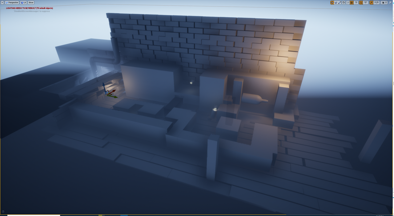
This is the starting level, the idea was we have two paths - one of them blocked so you have to go around and unblock it (later on removed!).
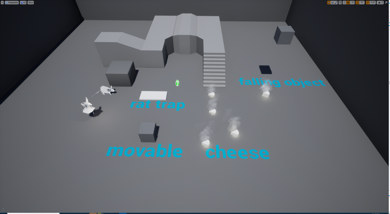
And a glimpse into some of the gameplay elements we have already thinking of and finished at the end of the day:
- Cheese - the main tool for you to move the baby rat.
- Rat trap - snaps and kills you and the baby.
- Movable - objects we deem to be movable in the world.
- Falling Object - falls and kills you.
- Main character - with picking up and dropping down cheese functionality.
- Baby rat - just follow cheese at this point.
We went to sleep at that night with a great smile on our face, as we have achieved so much!
We were looking up to the future of the game!
Day 3 - Animations, Assets & UI
Part of working on so many different things allowed us to divide and conquer. Here is a glimpse of that day, using screenshots and some of the work we've done.
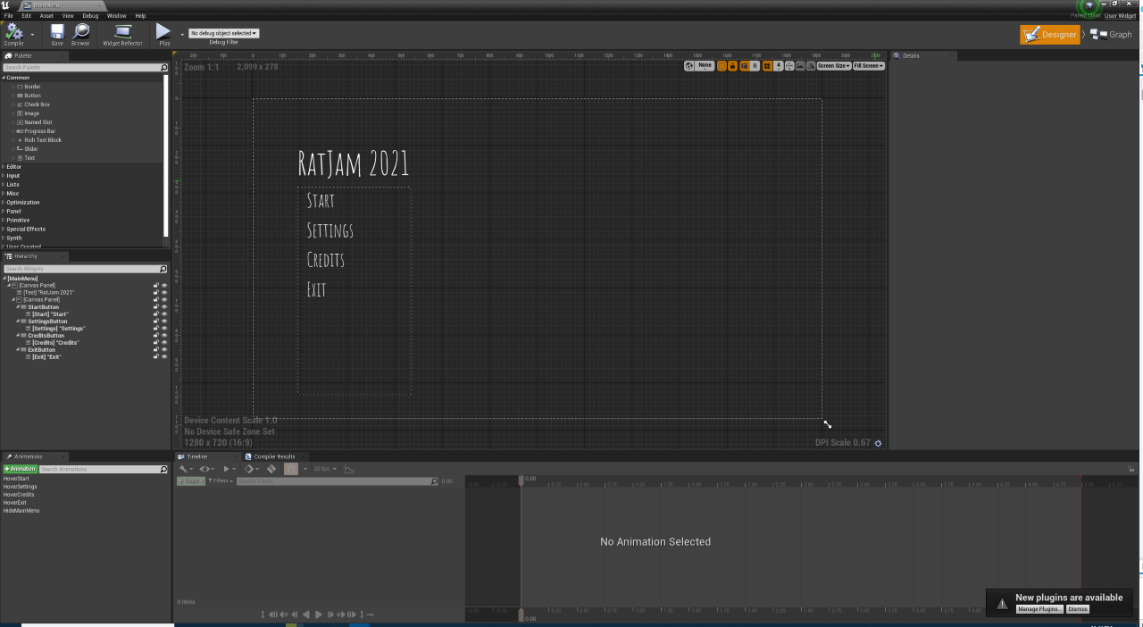
It was not the first time I was making a UI for a game, as we had some other projects together, but it was definitely the first time anyone externally would be touching! So I followed this tutorial.
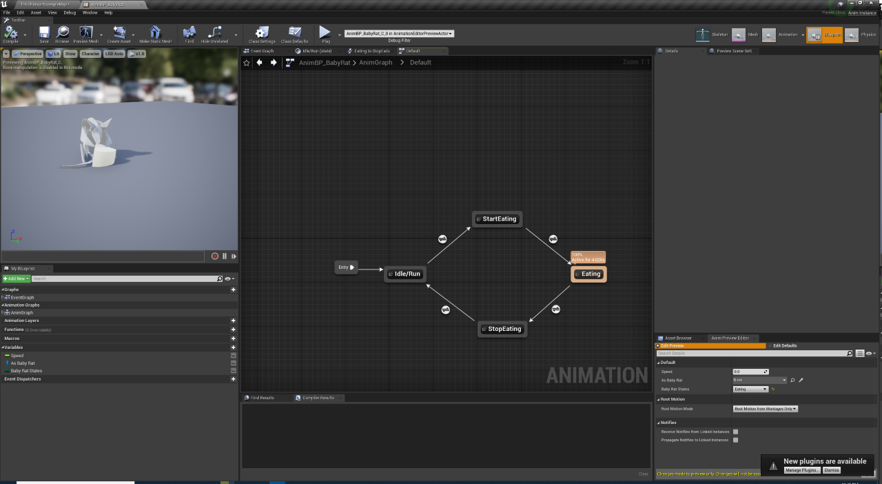
Some manual animating progress pic we had by the end of the day. Eventually it looked very cute, seeing the (annoying) baby rat getting to the cheese and suddenly switching to that animation.
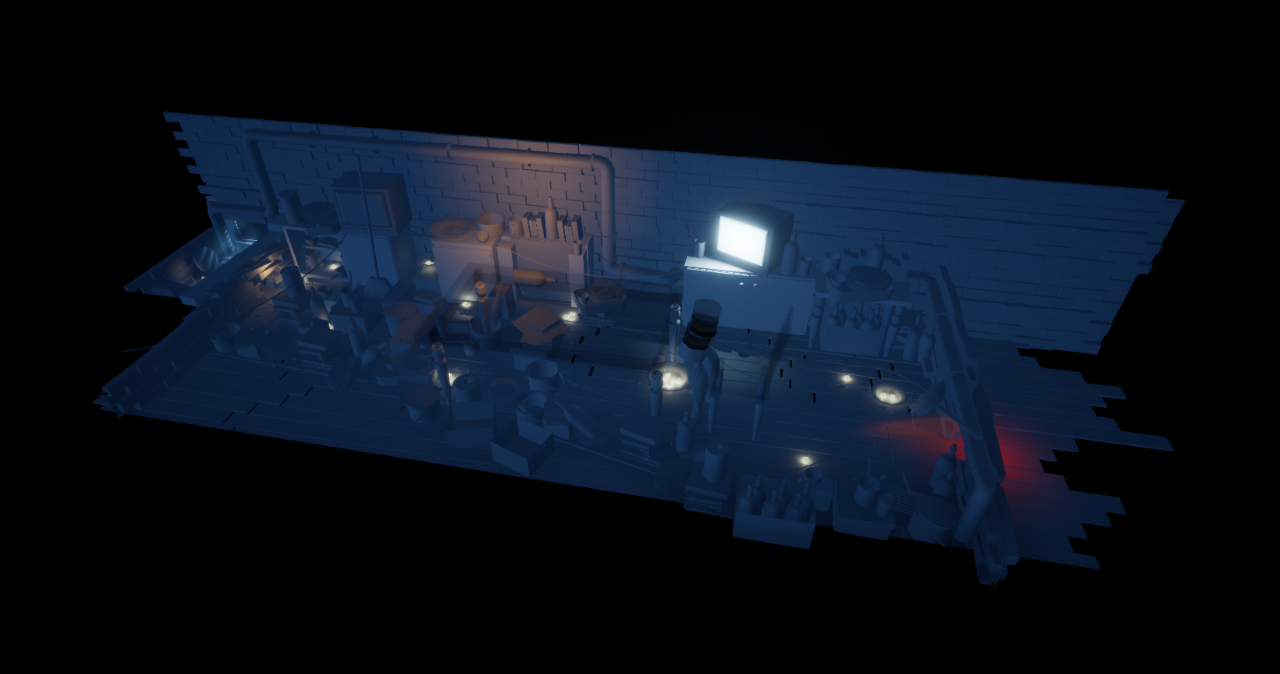
Here is a birds eye of the progress for the level at the end of that day, more impressive art by our main artist!
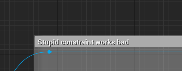
Some inevitable pain in the ass when trying work with constraints and not knowing much about them! The idea was to use the constraints for moving boxes in the level (or other movables). Eventually we went for pure physics based pushing, and not applying an additional constraint (as the object started going crazy).
Day 4 - Old Man, Big Level & Checkpoints
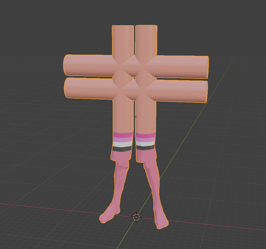
Initial version of how the old man would look, haha - you never see that part in the video game industry! Eventually we made it happen by removing the top part!
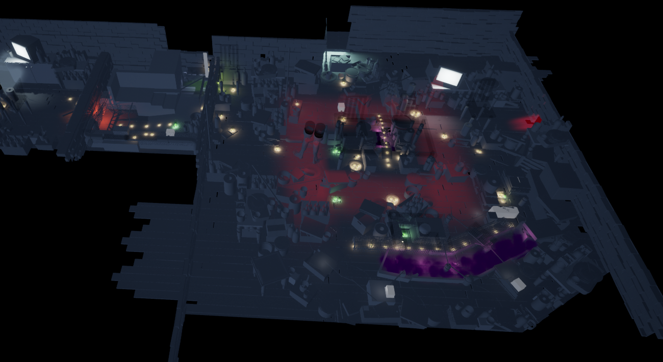
Huge pass on the level, including the movement of the old man around the table, a bunch of poison, and smoke that kills you around the level. We really tried to make it feel like the entire place is hoarded - and you are going through a "living room". Where previously you started in a "kitchen".
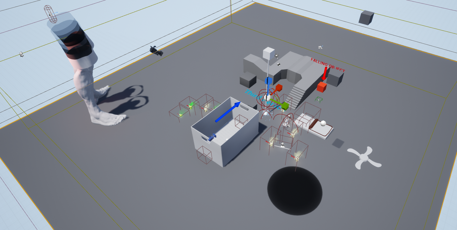
You may notice we have added quite a bunch of new elements to the picture - poison, the rat trap is much more refined. There's a fan that you may see in the beginning level (for aesthetics). Chewable boxes and electric cables. Some interesting things to take away: the more refined mechanics you add early on - the more things your level designer can work with and experiment.
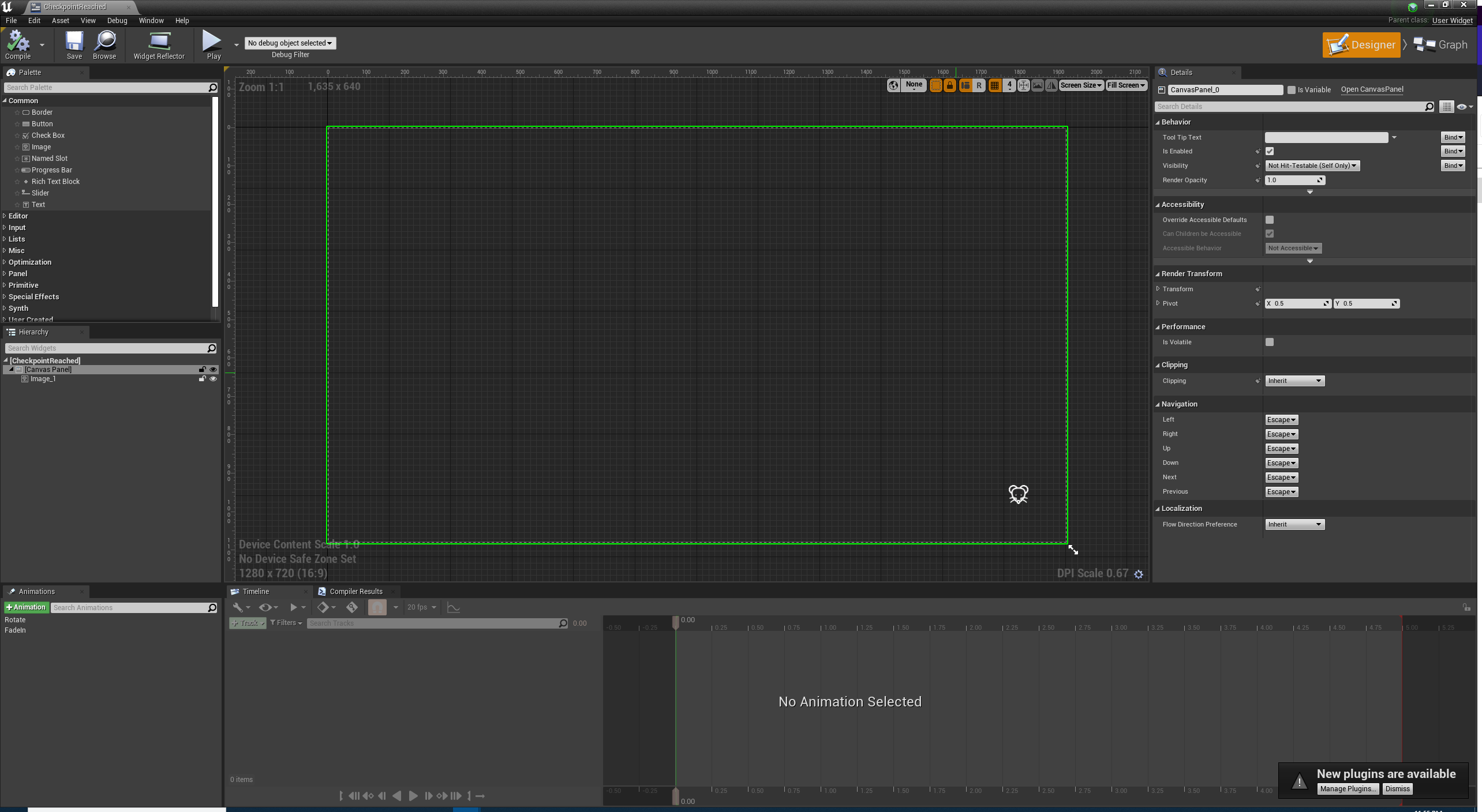
This is one of those hidden features people don't pay much attention to - checkpoints. Making them was not as easy as "call save level" blueprint, since there isn't one. At the end of the day we went for the approach of "save every objects transform, including the main character and the rat when you enter a volume" - but more on that on the next devlog and the challenges around it. The checkpoints seemed to work, with slight small mishaps!
Q&A
Why did you not use textures? Was it intentional or did you leave it for the end?
This was an intentional decision by our artist, we wanted to approach the visuals with lighting more than textures. Knowing it would cut down the amount of work but also serve as an important decision for the beauty of lighting arrangements. The textures we used are not the basic unreal ones, it was a slightly more complex one we used to really give an Ooomph to the scene. It had the by-product of also allowing us to highlight gameplay mechanics such as poison (aka kryptonite) cheese, where to jump, what was dangerous.
Can the old man step and kill the baby?
No, this was an intentional decision - as it would be wayyy too hard for a game that was already pretty hard. You had limited control on the baby rat already! But what was interesting is that you still felt stress for it, especially not knowing this design decision!
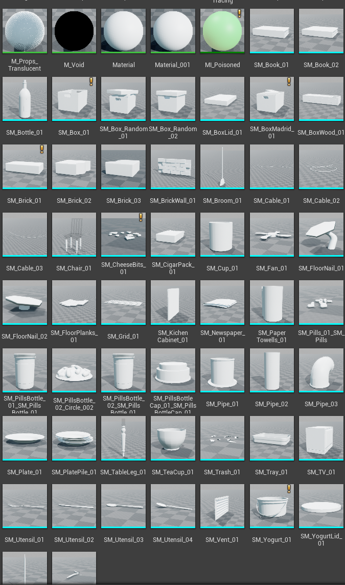
There's no way you made all of this in one game jam? What sourced assets did you use?
Actually, yes way! Our artist is very talented, and the only assets that we used are the next 59. They are not detailed at all, and they are replicated all over the level if you look closely. It was just a matter of cleverly placed assets! And since we had no textures it was a little bit harder to notice - since we didn't put any focus on them.
Will you make another devlog?
Yes! the next one will talk about playtesting, and some frustrations we had. Problems we have faced within the team and technically with the game, so stay tuned into that!
If you have more questions, put them in the comments below and we will do our best to answer!
Get The Rat Way Home
The Rat Way Home
Follow the story of an old man struggling with hoarding through the eyes of a rat trying to keep its baby safe
| Status | Released |
| Author | Vaerys |
| Genre | Puzzle |
| Tags | 3D, PuzzleScript, Top-Down, Top Down Adventure, Unreal Engine |
| Languages | English |
More posts
- Day 1 & 2 - Chaos and ClaritySep 02, 2021
Comments
Log in with itch.io to leave a comment.
Great breakdown! I ended up finishing the game and really liked it!
I'm glad you liked it, now we just have to convince the judges panel that it's worth a while!